Design
Design system vs style guide: what to build first (and why most teams overbuild)
Jun 5, 2026
Most SaaS teams spend weeks polishing the dashboard and a weekend on the onboarding flow. That ratio is upside down. In our experience, onboarding is where 40-60% of new signups quietly leave, and no amount of feature work fixes that gap. We’ve rebuilt onboarding for products like RecurPost and Upmetrics, and the pattern is always the same: teams add a tour on top of a confusing flow instead of fixing the flow itself. This guide walks through what SaaS onboarding design actually is, the framework we use with clients, the patterns that move activation, and the mistakes we see most often. If you’re a SaaS founder or product lead wondering why your signup-to-paid conversion is flat, the answer usually lives here.
SaaS onboarding design is the visual, interaction, and flow-level work that gets a new user from signup to their first real win with your product. It’s not a product tour. It’s not a checklist. Those are tools inside the bigger job.
The mistake most teams make is treating onboarding as a layer you add at the end, usually a tooltip tour wired up with a third-party tool. That almost never works. A tour on top of a badly structured flow just makes the confusion slightly more narrated.
Good onboarding design covers four things: how the user enters (signup, empty states, defaults), what they see first (information architecture, visual hierarchy), how the product guides the next action (contextual prompts, not modal pop-ups), and how they know they’ve succeeded (feedback, progress, first-value confirmation). Get those four right and you rarely need a separate tour.
If this sounds like a product design problem more than a growth-team problem, that’s because it is. That’s why we handle it as part of SaaS UI/UX design services, not as a bolted-on growth project.
Here’s something we’ve seen across SaaS redesigns: users almost never leave because a feature is missing. They leave because they never understood the product well enough to need that feature.
Research from Nielsen Norman Group on user onboarding is consistent on this point. Roughly 40 to 60% of signups never come back after the first session. That’s not a product gap. That’s an onboarding gap.
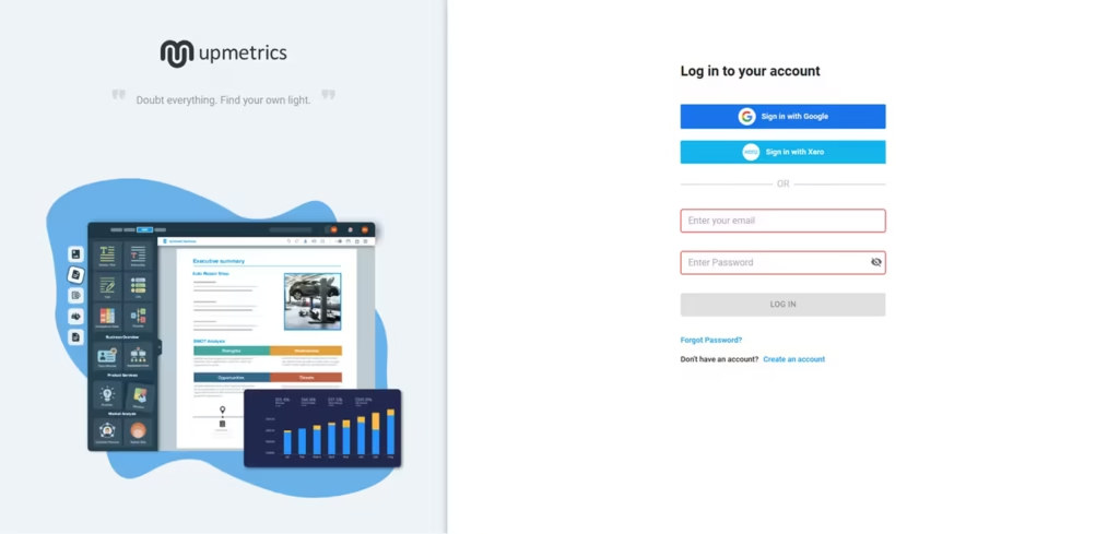
When we redesigned onboarding for RecurPost, a social media scheduling platform, onboarding completion went up 45% and recurring post usage rose 22%. We didn’t add new features. We restructured the path from signup to first scheduled post so the “aha moment” came sooner. On Upmetrics, a business planning SaaS, simplifying the same path lifted onboarding completion by 38% and feature adoption by 27%.
The takeaway we push with founders is uncomfortable but true: if your activation rate is low, your roadmap is probably wrong. You’re likely building features for the 30% who stuck around instead of fixing the path for the 70% who didn’t.
We run every onboarding redesign through the same four stages. This is the Onboarding Fix Method:
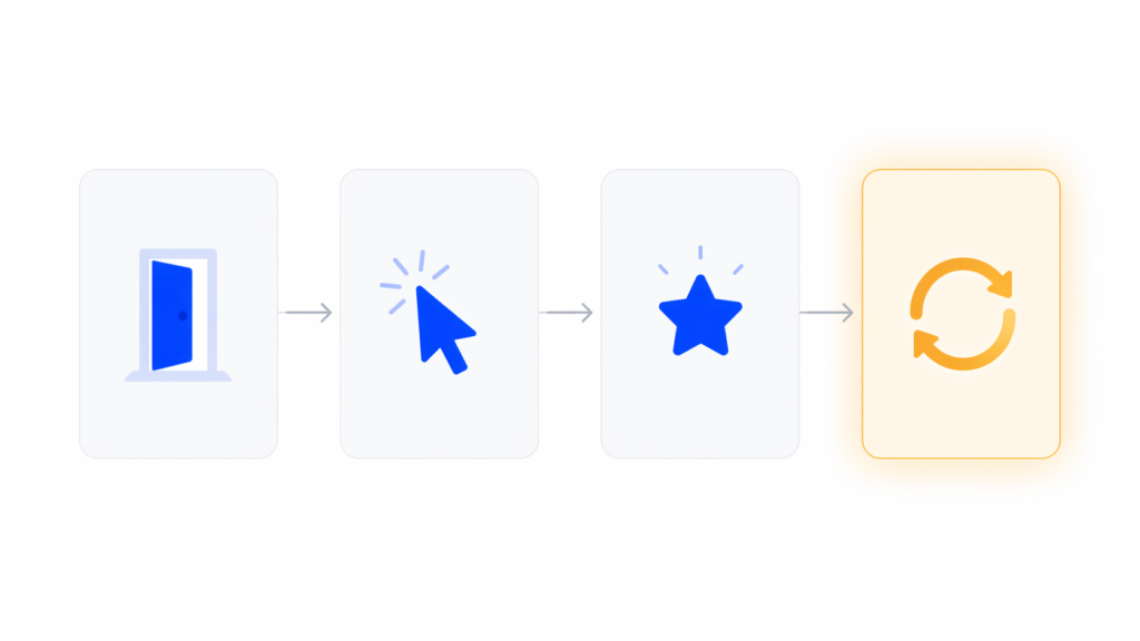
Most teams design stage 1 well, skip stage 2 and 3, and call email drips “retention.” That’s why redesigns that only touch the welcome screen rarely move the needle. You have to fix all four stages because they compound.
There are dozens of lists of “onboarding patterns.” Most are the same six items in different order. Here are the ones we actually use in client work, along with our POV on when each fits.
Ask for the minimum information needed to start. Email and password, ideally with SSO. Anything else goes after the user has seen value, not before. Figma’s browser-first signup is the canonical example. You start designing before you save. Most B2B SaaS products ask for role, company size, and phone number at signup and wonder why their completion rate is 60%.
This is one microsurvey on the welcome screen that branches the onboarding path based on what the user is actually here to do. A solo founder and an enterprise admin don’t need the same first-run experience. In our experience, this one decision has a bigger activation impact than five tooltip improvements combined. The Baymard Institute’s research on form usability backs this up: every unneeded field is a drop-off risk, so a branching survey that earns its fields outperforms a static form that doesn’t.
Show the core loop first. Hide settings, integrations, admin panels, and edge cases until the user asks for them. If your left nav has 14 items on day one, new users freeze. We almost always cut the first-session navigation in half during a redesign.
Contextual guidance means a tooltip appears when the user is about to take an action, not when they log in. Modal tours interrupt. Contextual prompts teach. If you must include a walkthrough, cap it at three to five steps and always let the user skip.
A good checklist auto-completes steps the user has already done. If they imported data before the “Import data” step, that box should already be checked. Forcing people to redo work is the fastest way to make them abandon. Checklists also work better when they’re persistent but collapsible, not a blocking modal.
We’ll cover this in its own section because most teams underuse it.
The moment the user completes the first meaningful action, the product should visibly confirm it. A toast that says “Saved” isn’t enough. Show the result. Notion’s first document renders the moment you type. Linear shows the issue in the list the second you create it. That visible result is the activation.
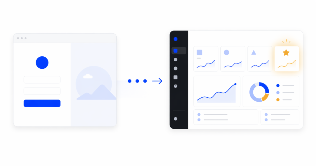
Before
After

Most SaaS onboarding writing assumes desktop. If your product has a mobile app or a significant mobile web share, copy-pasting desktop patterns will hurt you.
Mobile onboarding constraints are real. Less screen space means fewer tooltip anchors. Input is slower, so every form field costs more. Push notification permission is the highest-stakes decision in the flow and most teams ask for it at the wrong moment.
Our rule for mobile: never ask for permissions, subscriptions, or account details before the user has seen value. Show the product first. The push permission prompt should come after a moment where the user would genuinely want to be notified, not on screen two of the app.
We’ve seen mobile onboarding completion double just by moving the permissions screen three steps later in the flow. For a good example of mobile-first onboarding thinking, our SaaS redesign case studies include mobile products like World 11 where screen-by-screen sequencing was the main design problem.
An empty state is the screen a user sees when they have no data yet. It’s the dashboard on day one, the projects list before the first project, the reports page before the first report.
Most SaaS products treat empty states as placeholder screens. The word “empty” does most of the work, with maybe a sad icon and a “Create your first X” button. That’s a huge missed opportunity.
In 2026, the best SaaS products use empty states as their primary onboarding surface. Notion is the clearest example. The empty document isn’t empty. It’s a warm prompt, a list of slash commands, template suggestions, and a single clear next action. The “empty” screen is doing more onboarding work than any tour could.
Our Onboarding Fix Method puts empty states in the “first action” stage for a reason. They’re the surface where the user actually tries the product. If your empty state just says “No data yet,” you’re skipping the moment where onboarding matters most.
A good empty state does three things: it tells the user what this screen will show once it has data, it gives them a concrete way to get there right now, and it shows an example of what the filled state looks like. That example is what makes the user understand the value.
Most onboarding writing pushes PLG metrics: activation rate, time-to-value, day-7 retention. Those matter. But from a design perspective, there are four more tactical metrics we watch during a redesign:
These are the numbers a designer can act on. “Increase activation by 10%” isn’t a design brief. “Reduce drop-off between step 3 and step 4 from 40% to 15%” is.
[HUMAN INPUT NEEDED: link to or screenshot of a dashboard or analytics view we’ve built for a client showing these funnel metrics, if available]
After enough redesigns, the same mistakes keep showing up. Here are five worth calling out.
This is the most common one. A confusing flow gets a tour bolted on, users click through it, then have no idea what to do. Fix: rebuild the flow so the tour isn’t needed. If the UI requires narration, the UI is the problem.
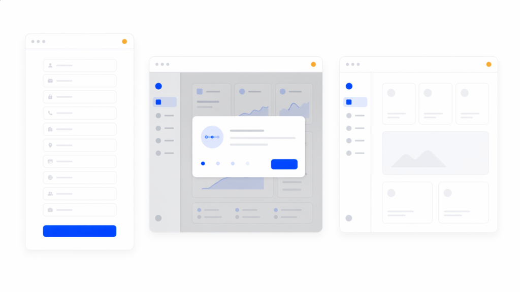
Long signup forms with role, team size, use case, phone number, and industry. Each field drops completion by several percent. Fix: ask for email and password only. Everything else can come after first value.
The user signs up and lands on a dashboard full of empty widgets, navigation, and no clear next step. Fix: design the first screen around one action, not ten. Every other option should be secondary.
A modal checklist that users have to dismiss repeatedly is worse than no checklist. Fix: make it persistent but dismissible, auto-complete steps the user already did, and never block the main UI.
The user completes the key action and the product says nothing. No visible output, no “here’s what you just unlocked,” no forward momentum. Fix: design the moment after the first win as intentionally as the moment before it.
User onboarding is the broader process, including emails, customer success touchpoints, and documentation. SaaS onboarding design is specifically the in-product experience: the UI, flow, and interaction work that gets a new user to first value. In our work, we focus on the in-product design because it’s the part with the highest leverage and the one teams under-invest in.
Shorter than you think. Under five minutes from signup to first value is a strong benchmark. Under two minutes is ideal for self-serve products. If your flow is longer, ask which steps could happen after first value instead of before.
Usually no. In our experience, products that require a tour have an information architecture problem a tour can’t fix. Contextual tooltips and well-designed empty states almost always outperform a modal walkthrough. If you do use a tour, cap it at three to five steps and make it skippable.
Benchmarks vary by category, but 40-60% activation within the first session is a reasonable target for self-serve SaaS. If you’re under 30%, the problem is rarely feature gaps. It’s onboarding design. That’s usually where we’d start a redesign.
Yes, if you have more than one clear user type. A microsurvey on the welcome screen that routes users to different onboarding paths is one of the highest-leverage design decisions you can make. One caveat: only ask what you’ll actually use to personalize. Asking without branching is friction without payoff.
We recommend reviewing onboarding metrics every quarter and running a focused redesign when activation drops more than 10% from baseline or when the product adds a meaningfully new core flow. Full redesigns every 18-24 months are normal for growing products.
Good SaaS onboarding design isn’t a tour, a checklist, or a welcome screen. It’s the whole path from signup to first real value, designed with the same care you put into your core product. The teams that treat onboarding as a first-class design problem see the activation lifts. The teams that treat it as a growth-tool integration usually don’t.
If you’re looking at flat activation numbers and wondering where to start, the answer is almost always: rebuild the entry-to-first-value path before you add anything. Fix the flow, then decide whether you still need a tour. You usually won’t.
If you want an outside read on where your onboarding is leaking users, talk to our team about a UX audit. We’ll map your current flow against the Onboarding Fix Method and show you the specific steps costing you activation.
jatin.creatrix@gmail.com
Design writer at 16pixel — a global UX and web design agency helping brands build world-class digital experiences.
Let's talk about your project and what 16pixel can do for you.
Book a Free Discovery Call